MY WEBSITE LAUNCH | 8 YEARS + GROWING
Well... as you may have already seen a few months back, I have been making some big changes with this photography business. The main one being my editing style + building a website to reflect my true self. I'm sure you won't be surprised to find out that it only took me 2 sleepless nights to change over this website.. mainly because when I envision something, I am not patient. I want it done ASAP. It was worth the endless handfuls of Halloween candy to get it all finished for late November. I don't know if it is a common thing for us artists, but I am constantly wanting to perfect my talent. Shooting, editing, marketing , the whole sha-bang!
Long story short, I have been on the hunt for a style in my website that reflects who I really am. As you will see below, it is a constant struggle. But I can confidently say that this current website restructure has been my favourite yet!
Before I explain my current website design, lets take a walk down memory lane ...
This right here was my first "official" website layout I planned. At the time, I was still going by Jalisse Clark Photography prior to getting hitched. I designed every single page in Photoshop and had a web designer implement it. It worked for the time being, but looking back.. WHY PINK JALISSE?! Pink is my least favourite colour and yet I was branding my entire business around it? *Shaking My Head*
Then in 2014 came this layout...
Ahh much better.. finally I was making a website theme with the colours I loved and a theme that fit my style. 2014 is when I created my logo.. the tree. I am still in love with the logo design as it represents so much of me. It came from one of my favourite verses and was a symbol for my love for the outdoors.
Now this leads to NOW...
Why the change?
Well my last mood board was inspired by the ocean (hence the shells, waves, and sand). It doesn't make sense to me because I rarely have the opportunity to visit the ocean and don't dream of sitting by the seaside enjoying a margarita like most do. My oasis is in the mountains, venturing out on a short hike, being inspired by mother nature, and loving all seasons.
My intro page was the hardest to do. What images to use to catch my viewers? Should the tabs be flashy or bold? Should it scroll down to see more info or let viewers find it on the tabs? Should I play music or not?
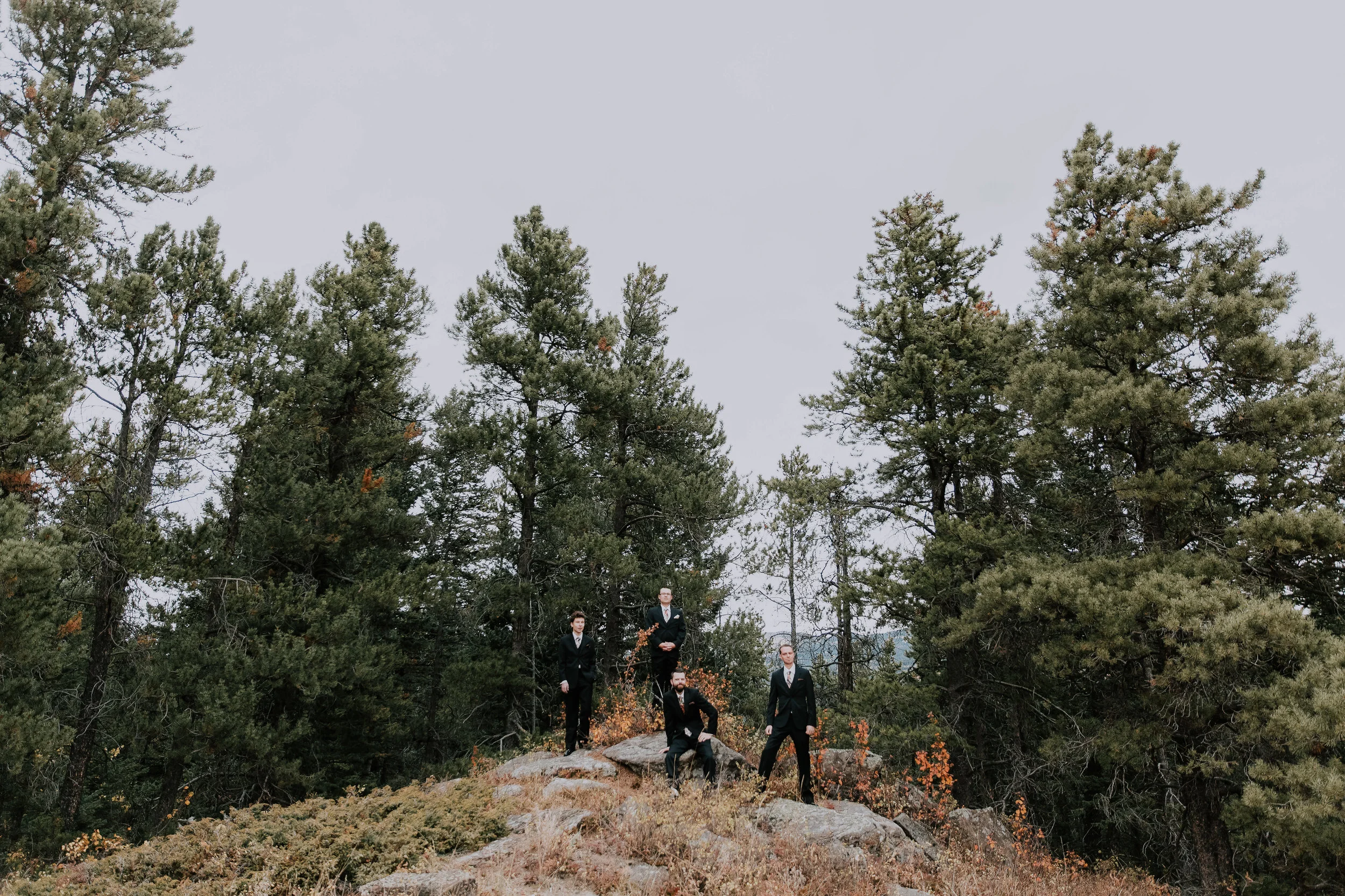
SERIOUSLY... a million and one thoughts run through my head when I'm on a halloween candy binge. At the end of it, I decided to choose SIMPLE. Always simple. I like to think our brains secretly like simple.. basic layouts. It relaxes our mind and is easier to navigate. This photo that I used at the bottom of the main page may not have the most epic backdrop - infact I shot them in a batch of dead weeds haha. BUT it does have love and again simplicity is key for me.
Oh the "ABOUT ME" section. Always the most difficult part to work on.. mainly because I feel like I have to sell myself, but also need to find photos of myself which resorts to me using my 3 year old headshot Sam took baha (what? Me picky with self portraits? Never.)
This time around, I kept things simple. I thought a few behind the scenes shots would be more impactful than ones of me smiling awkwardly at the camera. Showing what I do best.
If you have followed me for a while, you will notice some newer work but also some old work.. some really old work too. As an artist, I don't believe you have to be entirely 'up to date' and only showcase your newest work. I am still attached to 5 year old photos because of the emotion and backdrop it holds, so why not show it? I went back to 2011 + 2013 + 2015 weddings and family sessions to re edit images for this website as well as posting to social media. I couldn't edit all the weddings thanks to juggling my *almost* one year high energy son BUT I picked some here and there that spoke to me.
Here are some I worked on and shared on my page :)
And so there you have it... my new layout and design for 2018! Many rich dark tones that reflect my love for the forest and rockies!
Thoughts? Send them below in the comments section :)


